Data Explorer
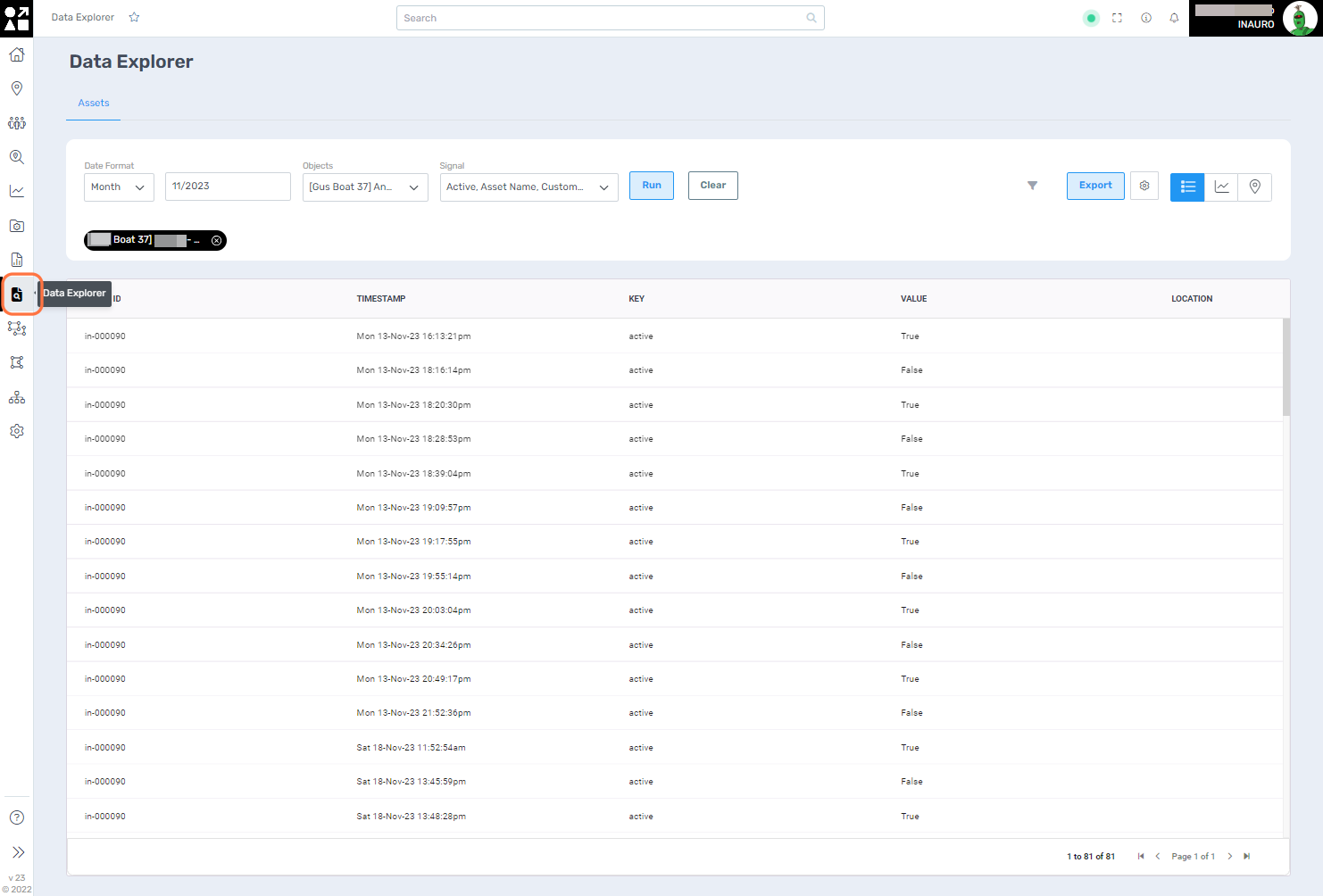
To access this menu, click on the File Magnifier - Data Explorer, right under the Reports Menu.
Tailor the data visualization models within this menu to strategically showcase your asset's telemetry within a defined time frame to create insightful representations. This feature enables you to craft visualisations that provide meaningful insights into the performance, trends, and patterns of your assets over specific periods.
Leverage this menu to create compelling and informative visual representations that support a deeper understanding of your assets' behaviour and contribute to more effective decision-making processes.
Fill all the required fields and click on Run to start using this tool.

The first option a list representation of your asset’s telemetry, offering a detailed overview of key metrics and data points chosen.
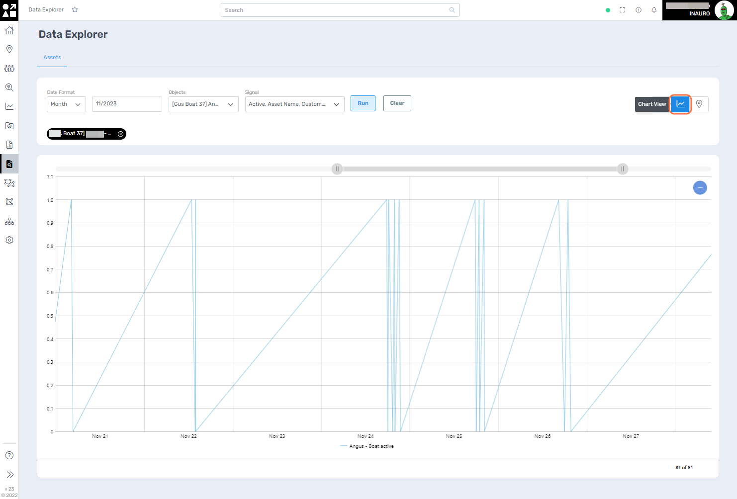
2. Chart View
Use the Chart View to visualize your asset's telemetry data in an intuitive graphical format. The Chart View option transforms raw telemetry information into clear and interactive charts, allowing you to discern patterns, trends, and fluctuations over the designated time frame. This visual representation enhances your ability to analyse complex data sets, offering a dynamic perspective on your asset's performance.

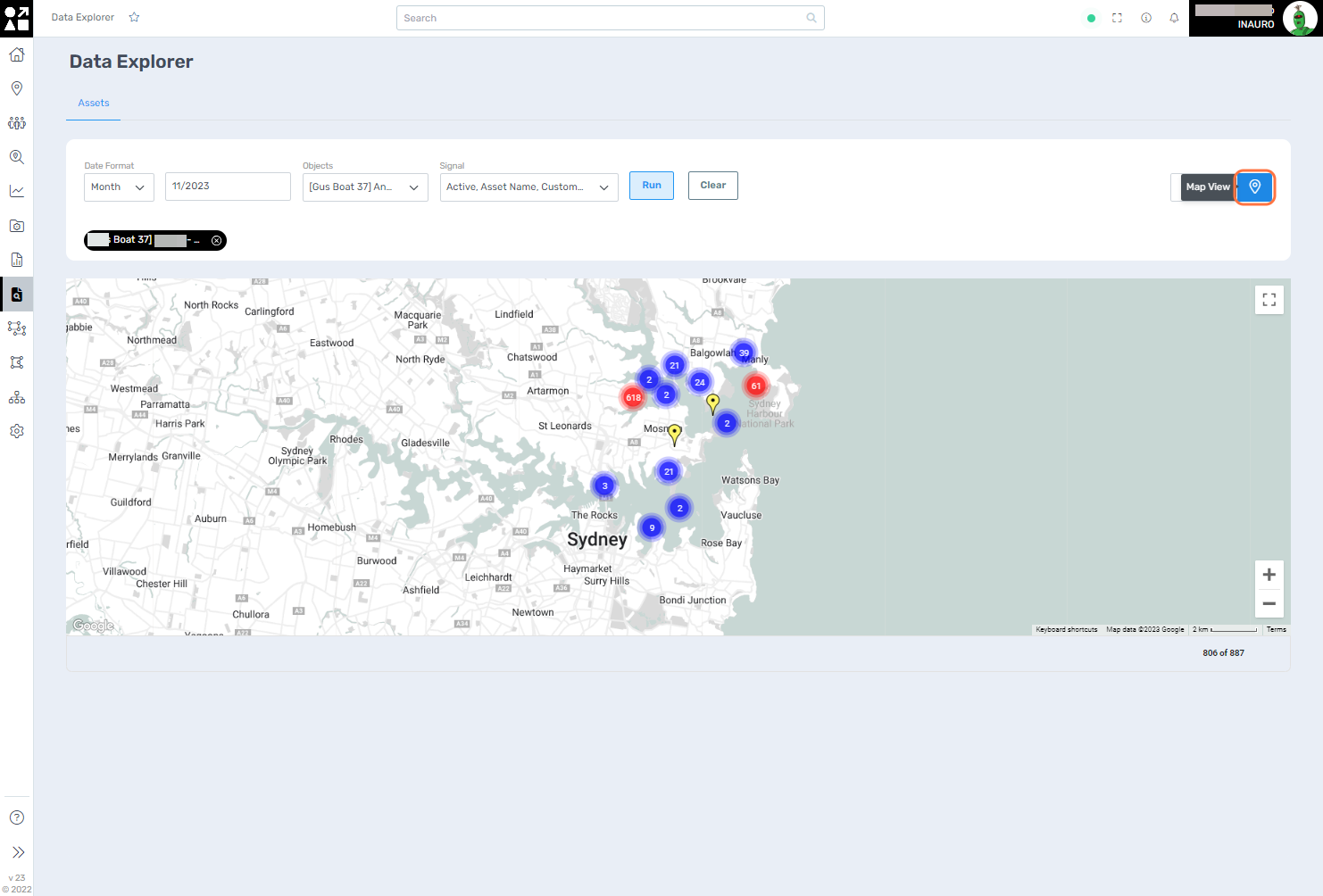
3. Map View
Use the Map View togeographically map and explore the spatial aspects of your asset's telemetry. The Map View option provides an interactive map representation, allowing you to visualize the geographical locations and movements of your assets during the specified time frame. This dynamic mapping feature not only offers a comprehensive overview of asset distribution but also enables you to track routes, identify hotspots, and assess geographical patterns.

