Dashboards
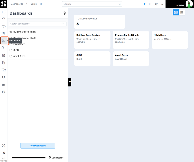
To access this menu, click on the Line Chart Icon - Dashboards, right under the Search.
Use this menu to monitor your business operations at a glance. Dashboards are a visual representation of your asset’s current status and provide key insights into various aspects of your operations. These dynamic displays offer a comprehensive overview of critical data points, allowing you to make informed decisions swiftly and efficiently. Dashboards serve as a centralized hub, consolidating real-time information on performance metrics, resource utilization, and overall system health. By aggregating data from diverse sources, such as sensors, databases, and external APIs, these dashboards offer a holistic perspective, enabling you to identify trends, anomalies, and opportunities for optimization.
Users have the capability to either design their own dashboards according to their unique preferences or enlist the expertise of our team for bespoke dashboard creation by initiating a support ticket.
The initial screen will show as empty. Create a dashboard and add widgets to it to access to the information you need. More information on creating these dashboards can be found here.hey OD
This screen offers additional functionalities:
Search dashboards;
Change to a list visualisation of current dashboards.
1. Snapshot
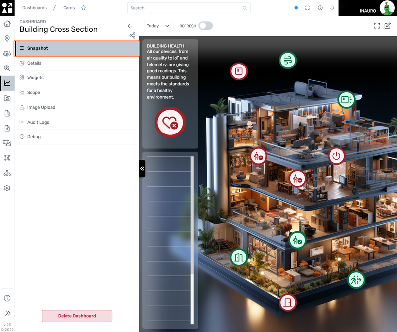
Clicking on a dashboard opens up its visualization along with all the corresponding settings for further exploration and customization. On this menu, you will have a visual representation of your data through an intuitive dashboard layout. Each element is thoughtfully arranged to offer a clear and concise overview of critical information. The visualizations within the dashboard are designed for accessibility, providing insightful charts, graphs, and widgets that present complex data in an easily digestible format.
This screen offers additional functionalities:
Refresh the dashboard;
Change the information displayed of current dashboard to Last 1 hr, 4 hrs, 12 hrs and 24 hrs.
2. Details
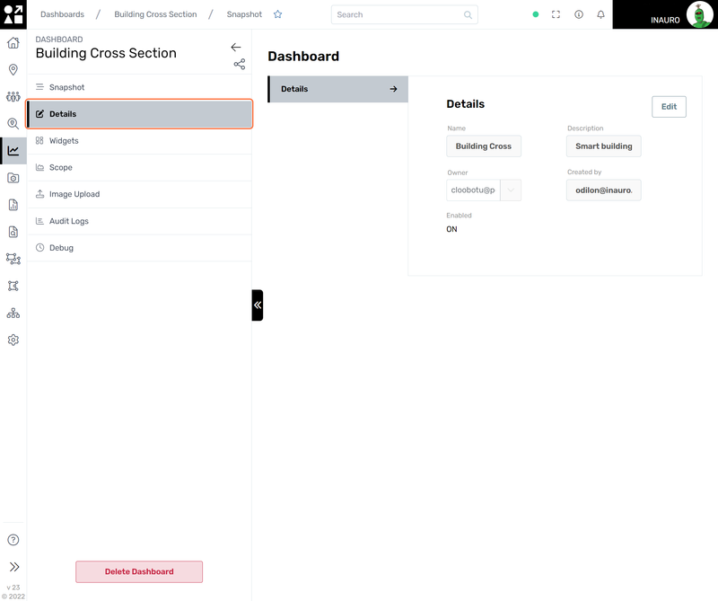
Navigate to this screen for seamless editing of the key details associated with a dashboard. Whether adjusting titles, updating descriptions, or refining other essential elements, this user-friendly interface provides a convenient platform to tailor your dashboard to specific preferences and requirements.
3. Widgets
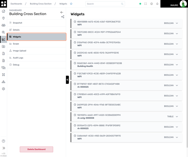
Widgets on a dashboard are dynamic components that provide a quick and comprehensive overview of real-time information. Available in diverse forms like charts and graphs, these versatile elements allow users to tailor their dashboards to specific needs. Beyond their visually appealing representations, widgets offer interactivity, enabling users to delve into details or customize views.
The Widget Types available are:
Boolean: Displays binary data, often represented as true or false.
Map: Visualizes data geographically, showing information on a map
Peg: Count: Counts and displays the quantity of items or assets.
Value: Represents a single numeric value or key performance indicator.
Pie Chart: Presents data in a circular graph, illustrating proportions of a whole.
Table: Organizes data in rows and columns for easy reference and analysis.
Text: Allows: the inclusion of descriptive text or information on the dashboard.
Multi Asset: Aggregate: Aggregates and presents data from multiple assets in a unified view.
Line Chart: Displays data points over a continuous line, ideal for illustrating trends.
Bar Chart: Represents data using rectangular bars, making comparisons between categories straightforward.
Users currently don’t have the capability to design their own widgets. To create one, enlist the expertise of our team for bespoke widget creation by initiating a support ticket.
4. Scope
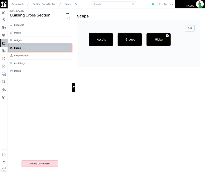
Specify the focal point of your Dashboard by choosing from Assets, Groups, or Global options. If you select Assets, the Dashboard will exclusively showcase information pertinent to the chosen assets. Opting for Groups means the Dashboard will address the assets within the selected group, and by choosing Global, it will encompass all assets registered in Perspio. This allows you to tailor the Dashboard's perspective to your specific needs, ensuring a nuanced and precisely targeted approach to managing assets within Perspio.
5. Image Upload
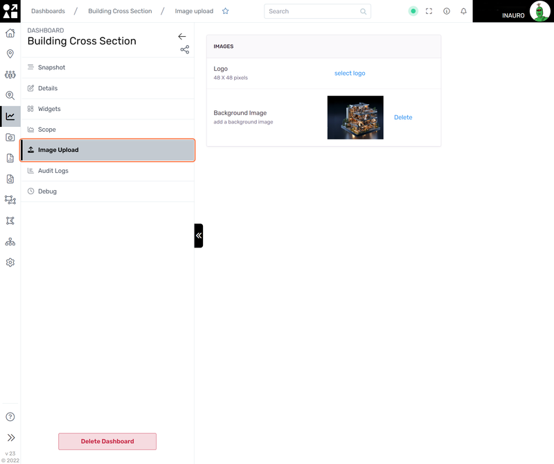
Utilize this screen to seamlessly upload both a logo and a background image to enhance the visual identity of your current dashboard. Adding a logo provides a personalized touch, while incorporating a background image not only improves aesthetics but also contributes to a more engaging and cohesive user experience.
6. Audit Logs
Explore this menu to conduct a thorough audit and analysis of all modifications made within this dashboard, along with detailed information on the individuals responsible for these changes. By leveraging the audit logs, you gain comprehensive insights into the history of alterations, ensuring transparency and accountability.

