Use this menu to create dashboards within Perspio. By crafting dashboards, you can have a visual representation of your asset ecosystem, providing a comprehensive overview of key metrics and performance indicators. Dashboards offer a dynamic and interactive way to analyse data, allowing you to quickly identify trends, anomalies, and opportunities.

1. Dashboard Details
On this screen, please take a moment to input the required information.

2. Define the Scope of your Dashboard
Specify the focal point of your Dashboard by choosing from Assets, Groups, or Global options. If you select Assets, the Dashboard will exclusively showcase information pertinent to the chosen assets. Opting for Groups means the Dashboard will address the assets within the selected group, and by choosing Global, it will encompass all assets registered in Perspio. This allows you to tailor the Dashboard’s perspective to your specific needs, ensuring a nuanced and precisely targeted approach to managing assets within Perspio.

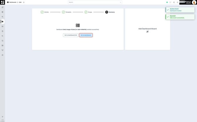
3. Dashboard Summary
Upon successfully completing all the steps, you will arrive at this screen, confirming the successful creation of your Dashboard. Once finished, you have the option to return to the Main Dashboard List page or proceed directly to the specific group by selecting Go To Dashboard.
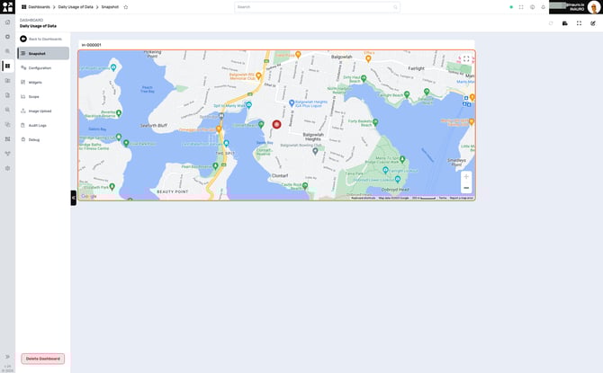
4. New Dashboard Snapshot
This is your newly created Dashboard page. Dashboards in Perspio showcase your asset data through Widgets – these are essentially dynamic tools that visually represent crucial data points.
To edit your Dashboard, click on the Edit Button, in the top right corner, as highlighted.

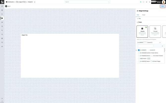
5. Adding Widgets
To add Widgets, click on the Add Widget Button, in the top centre, as highlighted.
Widgets give you a personalized snapshot of your asset landscape. To bring in the specifics that matter most to you, add these Widgets manually. It's a hands-on process that ensures your dashboard mirrors your unique monitoring needs.
The Widget Types are pretty straight forward. Whether it's charts, graphs, maps, or other visual formats, these options provide flexibility in showcasing your information. Consider how you want to visualize key insights and proceed to the next step.
The Widget Types available are:
-
Boolean: Displays binary data, often represented as true or false.
-
Map: Visualizes data geographically, showing information on a map
-
Peg: Count: Counts and displays the quantity of items or assets.
-
Value: Represents a single numeric value or key performance indicator.
-
Pie Chart: Presents data in a circular graph, illustrating proportions of a whole.
-
Table: Organizes data in rows and columns for easy reference and analysis.
-
Text: Allows: the inclusion of descriptive text or information on the dashboard.
-
Multi Asset: Aggregate: Aggregates and presents data from multiple assets in a unified view.
-
Line Chart: Displays data points over a continuous line, ideal for illustrating trends.
-
Bar Chart: Represents data using rectangular bars, making comparisons between categories straightforward.
Users have the capability to either create their own widgets inside the Dashboards according to their unique preferences or enlist the expertise of our team for bespoke dashboard customisation by initiating a support ticket.

6. Setting Up a Widget
On the right section of the screen, take a moment to input the necessary information with meticulous precision and completeness when dealing with widgets. Accurate and thorough data entry is key to ensuring the reliability and effectiveness of the widget.
Furthermore, once you've entered the data with precision, take advantage of the customization options available. Widgets can be easily resized and positioned anywhere on the dashboard, allowing you to create a layout that suits your preferences. This flexibility not only enhances the visual appeal but also ensures that the most critical information is prominently displayed for quick and efficient monitoring.
Click Save, in the top right corner to conclude adding a widget.
7. Customising a Newly Created Dashboard Summary
Once you've positioned and resized your Widgets, see the outcome in the final visualisation. Dashboards, composed of multiple Widgets, offer a comprehensive analytical experience. Consider this example: a Widget displaying the current position of an asset on a map, providing a real-time snapshot of critical data. Your dashboard is now a dynamic canvas, combining various Widgets to offer a holistic and interactive perspective on your assets.